


True Colors: How a Robot Changed My Wardrobe (and Maybe My Life)
A stylist's journey from color analysis skeptic to finding unexpected sunshine in her palette — and what it taught me about authentic self-expression

As someone who viciously loves freedom of self-expression, I've always been resistant to learning color analysis for myself or my clients. I believe that intuition is our most important feature, and we should be able to integrate anything we lean towards liking into our style without labeling it as "wrong" or "right." Also, rules just make me suspicious, as I worry there's a seed of the patriarchy hidden inside of them, and maybe rules are for people who want to live by someone else's definition of attractiveness. But part of being free is the ability to make educated decisions, and I am the first to admit that I never gave learning my colors a chance.
As a painter, I have become more and more fascinated by color, watching how certain colors interact with each other, and how contrast can be used to enhance whatever is next to it. I am drawn to every color in my art practice and always want to play with all of them (I'm just not a zorn palette girlie). I can see how cool and warm tones can vibrate off of one face, let alone how many colors exist in one cloud. What's strange is that despite my unwillingness to limit my palette hues, I rarely find myself thinking about the colors I choose to wear in this same way. I can wear whatever color I want in my head, but I am limited in my practice.
I have been (robotically, I suppose) wearing mostly neutrals, earth tones, or greyed-down versions of brighter colors for years. Sometimes I would find a colorful piece and wear it a few times, but I usually reserved those bold pieces for special occasions. In my mind, the boldness had to be used sparingly, because it felt more memorable, I wouldn't want to be seen wearing that same dress twice, or maybe I was worried I would get bored of them if I integrated them too much (this can happen with bolder printed pieces, especially).
It wasn't that I didn't like color. In fact, I'd often admire vibrant hues on others or pin colorful outfits to my style boards. But whenever I'd venture into a store and reach for something bright, a familiar voice would whisper: "Can you wear this all the time, with all your other stuff?"
So I'd retreat to my safe, watered-down tones, telling myself they aligned more easily with my sustainable, minimalist approach to wardrobe building. But what about the part of me that values freedom of expression? I wasn't taking my advice; I was only shopping for one side of my personality (the practical side), not the wild and free side of myself that I know exists alongside the practical one.
The Color Analysis Disappointment
So finally, while stranded in my house for a week while my car was being repaired, I downloaded one of those color analysis apps that promises to reveal your perfect palette. You know the ones—upload a photo, and algorithms analyze your skin tone, hair color, and eye color to declare which "season" you are. I know a lot of color analysis is about the relative contrast between your hair, eyes, and skin tones, plus whether you err on the cool or warm side. For all my experience with painting, with color, with styling, I had no idea if my skin tone was more on the warm or the cool side; to me, it seems both. I was ready to let the algorithm take the wheel on this one.
I was secretly hoping for Autumn. I've always been drawn to those rich, earthy tones—burnt orange, olive green, rusty red, and cognac brown. They felt warm, grounded, and somehow connected to the natural world in a way that resonated with me. I wanted some validation that my intuition was steering me correctly all this time.
After submitting my photo and waiting through the analysis, the app's verdict appeared on my screen: "True Spring."
WTF.
The palette it recommended was full of clear, bright colors—coral pink, turquoise, bright yellow, and apple green—colors that felt foreign to my brooding soul, too cheerful and vivid for the more contemplative energy I wanted to project.
"This can't be right," I thought, taking a selfie in front of a different window with different lighting. And another. But the result remained stubbornly consistent: True Spring.
According to color theory, I "should" be wearing those bright, clear colors to complement my natural coloring. But everything in me resisted. Those colors didn't feel like me or express how I wanted to move through the world... OR DID THEY?
The Color Identity Crisis
This kicked off what I can only describe as a color identity crisis. I tapped through the recommendations the robot inside my app told me to shop for. Orange blouses? Neon green dresses? Who is this person I am supposed to be now? Someone who plays tennis and has brunch outfits? (There is Nothing wrong with these things, but they are just a stark contrast to my paint-splattered androgynous collection of army pants.)
I needed to let the concept of True Spring simmer and wash over me. In my googling, I read a description of "what to do if you're a True Spring, but your heart is drawn to the decay of Late Fall?" that told me to imagine that a True Spring is someone who looks best in the colors associated with the height of spring.
Simply put, I look best in colors that seem "drenched in sunshine.”
That sparked something in me. I looked around my home, filled with bright pinks, warm greens, and browns. The sun was literally shining through a prism in my window and casting tiny rainbows everywhere. The echoes of once brushed-aside compliments on my personality being like “a ray of sunshine” rang in my ears, like "Hey, dummy, you can be sun-drenched AND a brooding introvert, too."
The Personal Color Revelation
Another breakthrough came during a conversation with a client experiencing a similar dilemma. We used my same color analysis app (since it lets me take as many selfies as I want), and she discovered that she's a Summer attracted to Winter.
As we talked, I realized that color analysis could be used to expose something we might have lost touch with somewhere along our sartorial journey. Color isn't just about how you look—it's about how you feel and how you want to express yourself to the world, and sometimes we err too far into the depths of one side of our story. This client, like myself, wanted to dress to put forward her intellect, create calmness around herself, and be a comfortable place for her therapy clients to land. Summer colors were more saturated but cool, and it felt a bit off the mark for how she envisioned her style. But when we shopped together, I intentionally added a few summery hues, wondering what the response would be. Lo and behold, some of those pieces captured our imagination, seeing how the cool brights brought some of her natural mountain-town living dreams to the forefront.
Traditional color analysis focuses exclusively on physical characteristics, something I have traditionally shrugged off as superficial in my more contemplative stylist brain. We are more than just the contrast between our skin tone and hair color. We are our personalities, emotional landscapes, values, and unique ways of connecting with the world. But what if the colors that are supposed to be right for us, actually can say something deeper?
Maybe many of us have been in denial of what's objectively true about us. Being a misfit could be about embracing both the surface and the deep and creating our own cocoon of harmony within our personal style.
The Great Color Experiment
So what have I done since allowing the truth of my True Spring color palette to wash over me? I started with an unseriously hot coral mani pedi & then by walking around Nordstrom blurting out "TRUE SPRING" in the lingerie section. At the same time,
helped me find my first bra in 5 years. I landed on a coral and a bright blue (ok, I guess turquoise), which to me have always been Florida Golden Girls colors, but objectively looked good as hell on me. I knew bras would be a safe way to add scarier colors since no one needs to see them. Still, I have a lot of fun imagining what sheer tops would elevate my orange bra into outfit integration status.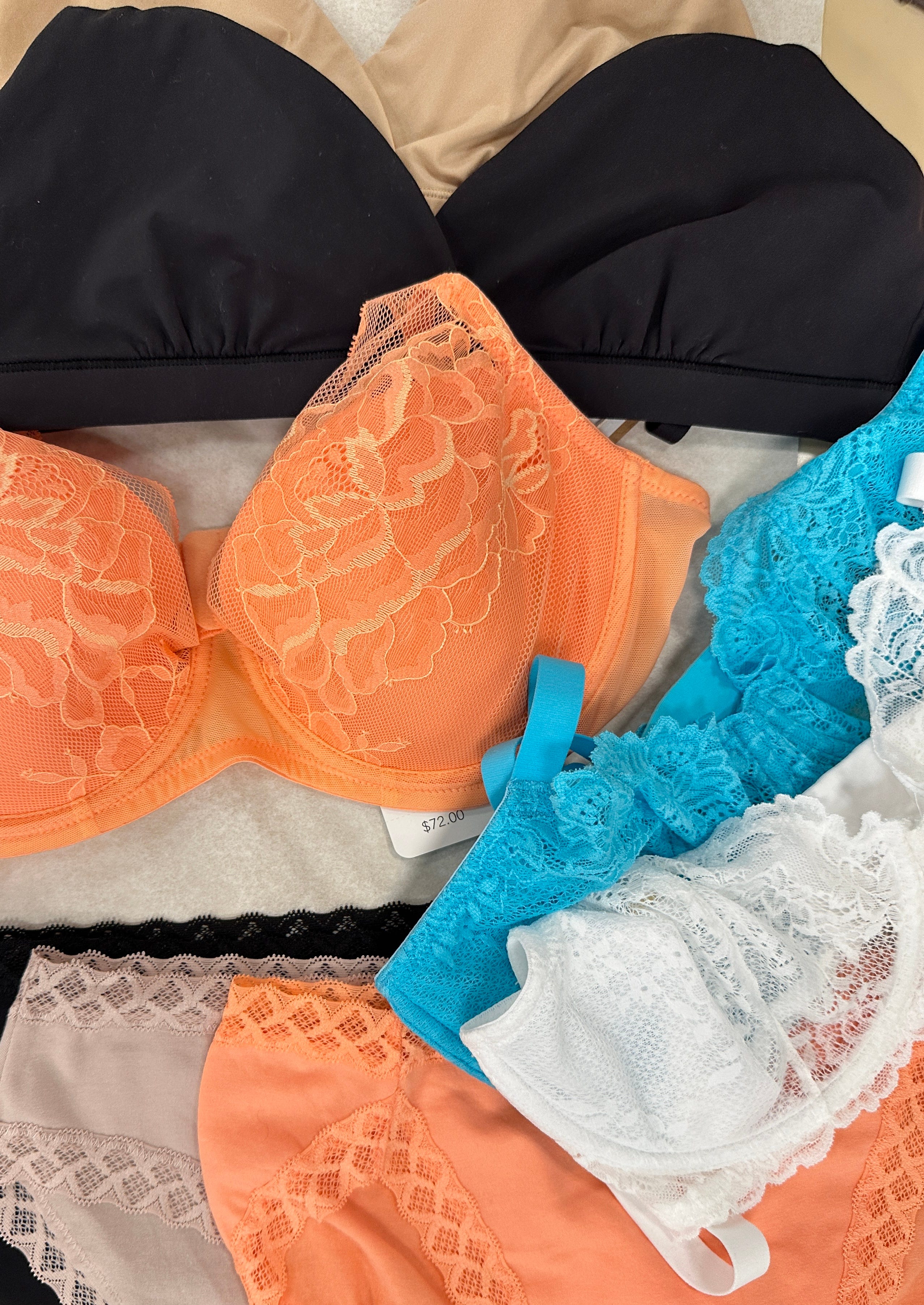
I also decided to cherry-pick my favorite true spring hues for my seasonal t-shirt order from sustainable brand jungmaven, who luckily still had my new favorite color "apricot crush" in stock:
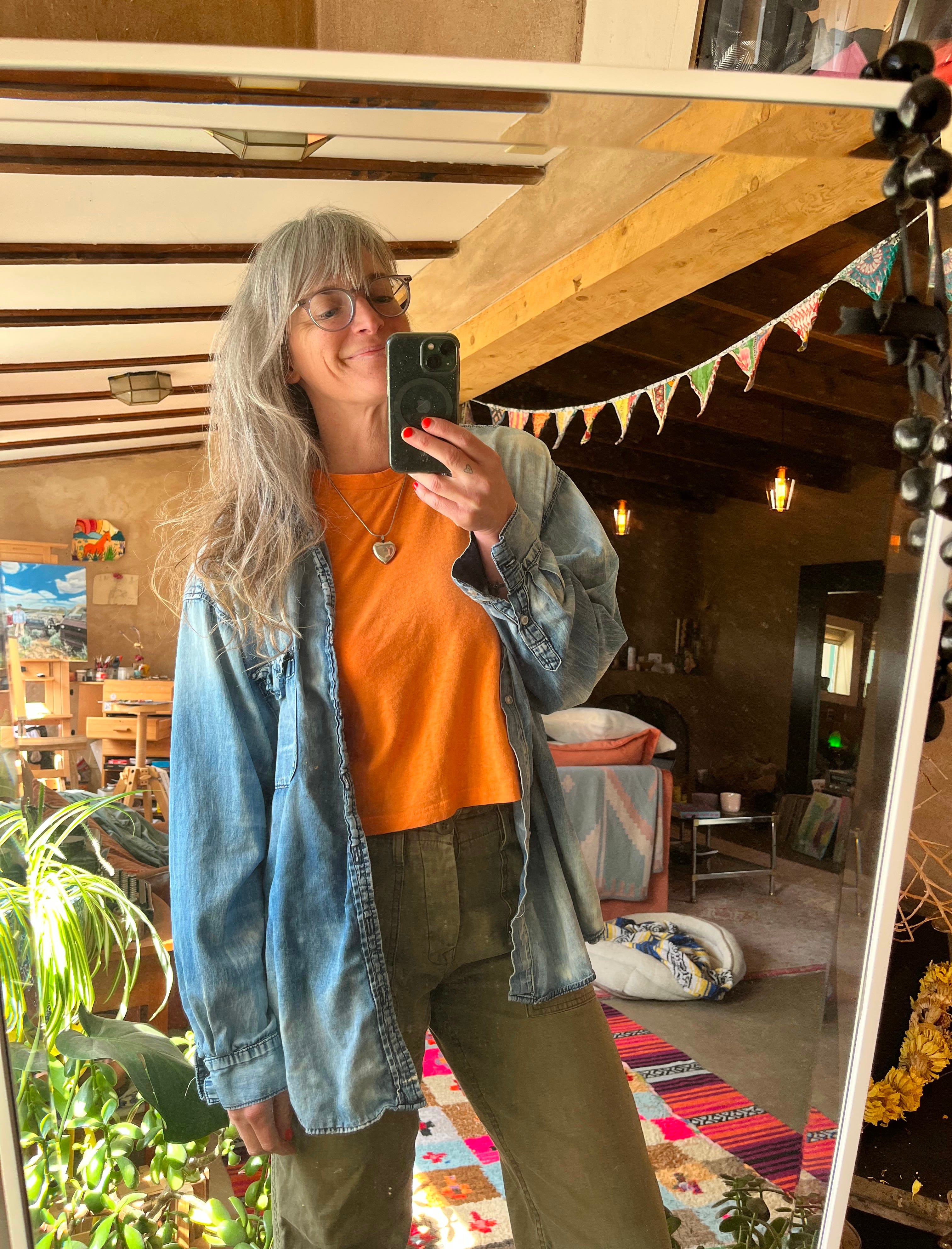
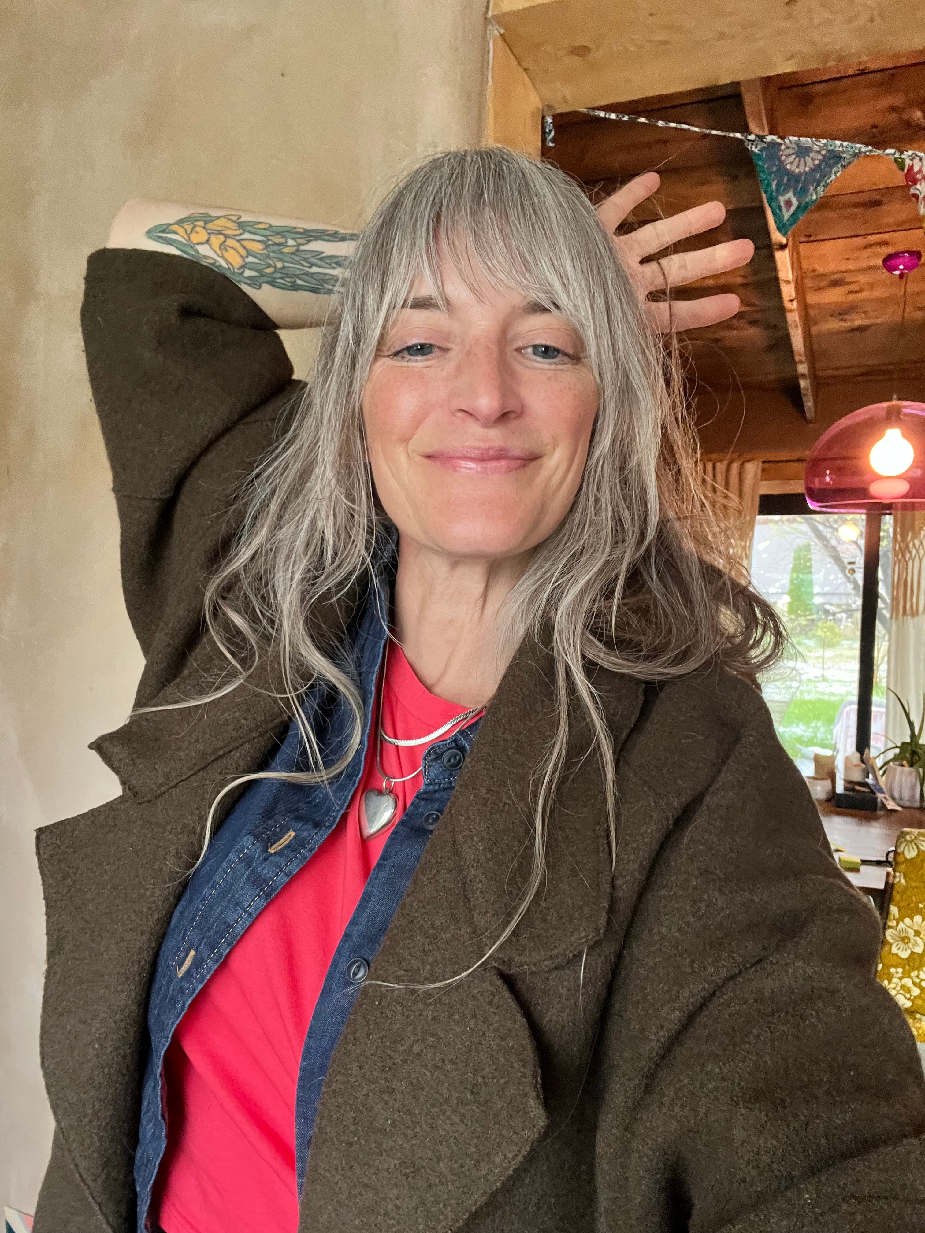
And then this one, which I wore yesterday to the doctor (not a place I typically feel sunny in), and was told "wow, I love that bright pink on you":
These springy colors bring new life to my favorite fall-toned pieces, satisfying my practical side by giving me more easy-to-compose outfit options. The painter in me is satisfied by imagining all the new color combinations I can make now that I have these new colors on my palette to play with. And the person who craves alignment can relax too because I can integrate this other side of me, the springy, bright side, which I always thought was so strong in my presence already, but perhaps needed some more nuanced visual unlocking to bring into being.
Or maybe I have just reached the point where I allow a robot to change the course of my life.
I guess it can't be too terrible to lead with sunshine rather than cynicism 😉
Beyond the App: A New Color Philosophy
This experience fundamentally changed how I approach color, both for myself and with my clients. Here's where I've landed:
Technical analysis might be deeper than you think? Color seasons and theoretical flattery are interesting information, and of course they're not the final word on what you should wear, but perhaps they’re saying something you might want to explore nonetheless.
Energy alignment could still be hiding. A color that energetically aligns with who you are will serve you better than one that simply complements your skin tone, but don’t forget your energy can stagnate too! You might revisit what colors you’re drawn to every so often.
Your color attraction is meaningful. If you're consistently drawn to colors outside your "prescribed" palette, your intuition is telling you something important about how you want to feel and be perceived.
Compromise is possible. I've found that I can adapt autumn colors to work better with my spring coloring by adjusting their clarity and brightness slightly. A clear rust rather than a muted one. A slightly brighter olive rather than a dusty one.
Today, my wardrobe is predominantly filled with those washed-out tones I love, slightly tweaked to better harmonize with my coloring. I've found my sweet spot between the technical "rules" and my personal truth.
Your Color Intuition
If you've ever felt disconnected from your "prescribed" color palette, I invite you to try a simple experiment:
Select one color you're naturally drawn to but have been told isn't "your color."
Find a piece in that color and wear it for a full day, paying attention to how you feel in it (not just how you look).
Notice: Does this color energize you? Ground you? Make you feel more or less confident? More or less like yourself? You might keep a daily outfit journal during this time noting:
What I wore
How I felt wearing it
My energy level throughout the day
How I interacted with others
Any comments received
Share your experiences in the comments. Have you ever felt the disconnect between the colors you "should" wear and the colors that feel right to you? How did you resolve it?
Remember, the most powerful style choices don't come from apps or external rules—they come from listening to your own inner wisdom about what makes you feel most authentically yourself.
Even if your heart says "Autumn" when the app says "Spring."